Archive for the ‘reviews’ Category

the finest Microsoft product I ever owned

May 9th, 2007

The Microsoft Intellimouse Explorer 3.0. Yeap, they may sell a whole lot of crappy software products, but this is one they really got right.
microsoft_intellimouse-explorer.jpg

Best mouse I ever had. Before the optical age, mice would clog up with dirt and wear out. Well not anymore. I've had this one for a great many years, the longest lifespan for a mouse yet.

It's so ergonomic that any other mouse feels totally alien and awkward. The only problem is that the wheel scrolls so softly that the threshold for scrolling a bit too low, and sometimes it skips on its own. So when watching a movie in mplayer, it will seek forward without being asked to.

But otherwise it's perfect. Up to now. It seems the buttons are getting worn out by now, and sometimes one click registers as two. This isn't uncommon with crappy mice, I've seen it before. But in this case a sure sign of old age. It's time to replace this old trooper.

Any recommendations?

powerpoint productivity

February 2nd, 2007

I find it interesting that office suites are often dubbed "productivity suites" by vendors. Of course, they are "productive" software compared to say.. Solitaire, but are they really "productive" in the absolute meaning of the word?

Claim
By making office software easy to use, the user doesn't have to waste time on learning how to use the software, because it's so intuitive that any idiot can use it. And thus you're more productive.

Counterclaim
If it's easy enough for idiots to use, won't idiots use it? Or rather, to be a little more accurate, won't users use it at the intellectual level of an idiot? How, and why, would they rise above that level if it's all they need to get by?

As someone who thinks about software, writes software, uses software, and comments on software, it pains me to see how some people use software. It really makes me sad.

The whole office suite concept was never my cup of tea. I used it because it seemed to be "the way" to write documents, but deep down it always bugged me. Then I got into using latex for document creation and it's like a whole new world opened up. Structured documents, what an amazing thing. It took me a while to get used to the latex way, but that's because I had to de-program myself of those bad habits. Now I wouldn't use an office suite for anything ever.

Here's how Ms Office works. You sit down at the desk, your friend points to the keyboard, you press a key, the character comes up on the screen. This is pretty much the intellectual level at which most people use Ms Word. Of course, the software has other features, it has functions to get things done faster/better/nicer. But most people, and that's probably 90% or more, don't know/don't care/wouldn't care about them. As long as they can just plug along.

I gave a presentation about two weeks ago, I had 20 slides, and it took me a couple of hours to write the presentation in latex. I didn't have to re-learn anything, because latex is the same whatever document you're writing. The process was entirely smooth, as it wasn't my first time, so I knew what I was doing. I've done maybe three presentations in latex, and by the third one I felt completely comfortable.

Last week my group was obliged to give another presentation, and this time another guy did the honors. But we all wrote it together, so he manned the computer while we discussed the content. A computer screen tends to draw your eyes in, but I was fighting the urge, I really couldn't stand it. First the guy designed a little logo in Ms Paint, which he included into the slides. When I said the logo could use a slight modification, he had to change the image on every slide one by one. Then he thought it would be nice to have a little index of the presentation on the side of the slides, which was a nice touch. So everytime he added a slide or renamed another, he would update the index on every single slide manually. Then it was the layout.. when he combined images with text, or even just when adding lists of points, often the layout wouldn't fit, there would be a forced linebreak, or something would clash, so he had to reposition the text fields. He spent more time doing these updates than actually adding content, in the form of keywords mostly. I felt like chewing my arm off watching this.

Yes, Ms Powerpoint might just have templates. And it might just have indexing. But what's the difference when noone uses this? It was certainly not the first time the guy made a presentation, I'm sure he'd done plenty of them before. But this was his level of usage. Because Powerpoint encourages you to act an idiot, that's what people become.

Needless to say, this has very little to do with productivity. Busy work, that's what this is. It's the computer equivalent of digging holes and then filling them. The general level of document creation is just appalling to me. That Ms Office be the standard for exchanging documents, and seeing how bad they look and how incredibly messy the whole process is, it's astounding.

Miranda IM : braindead design

December 12th, 2006

I was on a quest to find a Windows jabber client That Doesn't Suck, which is a surprisingly tall order. Along the way, I came across Miranda, which looked promising at first. The project's goal, apparently, is to develop a small and easy client. The website makes a good impression, in fact it turns out to be a lot more fetching than the client itself, which isn't beautiful. But enough about looks. I was testing for a certain subset of features, and the first impression was good. Multi protocol client, low memory footprint, small windows, and it seemed to have all the essentials - file transfers, avatars.. hm no emoticons? Turns out Miranda is so small that emoticons are treated as a plugin. I download the add-on, a .dll (not the first thing that comes to mind when you say user friendly) and dump it in the right place. Yes, emoticon themes are supported. I'm interested in that, because I maintain one.

Now, it's bad enough that every client has a different way of dealing with emoticon themes. And these approaches do not vary in what functionality they provide, all of them do the exact same thing. Making an emoticon theme is no more complicated than this:

[default]
angel.png *angel* *A*
biggrin.png *biggrin* *g*
blind.png *blind*

The above is from gaim. It's simply a picture, and a list of replacement strings which activate it. There's nothing more to a theme declaration than this. For the purpose of my emoticon theme, I wrote a few simple scripts which generate these files (which are all similar). Thusly, I wanted to find out how to generate a theme file for Miranda.

I was in for quite a surprise. The declaration itself is very much the same, of course:

; defines-----------------------------------------------------------------

Smiley = ".\OGSmileys.dll", -127, "*biggrin* *g*"
Smiley = ".\OGSmileys.dll", -122, "*blind*"
Smiley = ".\OGSmileys.dll", -111, "(B) (b)"

But what of the smilies themselves? They're in a .dll file! That's right, in Miranda's Smaller, Faster, Easier spirit, they have stored the images in a .dll. This simply means that the same bits are aggregated in a library, there's nothing more happening there, they're not being compressed or processed in any way, just plain stored.

Need I mention that emoticon themes are supposed to be easy to create? It's not supposed to take a coder to do it, it's a feature for users to enjoy, to tinker with, without needing any help.

So for someone who wants to make themselves an emoticon theme for Miranda, they need a compiler! Yes, nothing easier than tossing a few images into a directory and setting up a definition (like the one for gaim), that any schmuck can figure out, no you have to compile the bloody thing. Screw that all the other clients are doing it this way, we don't give a shit, compile it or piss off. Needless to say, for me to find and set up a compiler just for this would be a humongous hassle and no sooner did I discover this interesting little quirk did I dump Miranda altogether.

The Miranda people are so in love with .dll's, that connecting to Google Talk (which is also an add-on), you need to download another .dll. Then you need to install an openssl library as a whole separate install. Yes, ssl also an add-on, who would possibly need that?

UPDATE: Apparently there are other ways to do this.

UPDATE2: Factual errors were discovered after this entry was written, as such I posted the link above, to the Miranda forum, where the clarification was established. However, not unreasonably so, the Miranda people have urged me to clarify the situation right here as well, so as not to misrepresent their client.

Emoticons in Miranda were historically stored in .dll's. That explains why the theme that comes with the plugin is as such. However, that is not the only way to store them, and the emoticon definition example included in the plugin (which I failed to notice), explains the different options, including just using pngs.

It was never my intention to misrepresent Miranda, and while my observation about .dll's was not incorrect, it was incomplete.

gmail beta vs yahoo mail beta

October 1st, 2006

By now everyone knows gmail, it's practically become a verb, just like google. Yahoo then, not wanting to trail too far behind, has stepped up its efforts to polish off its webmail offering to match gmail. gmail offers 2.7gb of storage space, yahoomail gives you 1gb, either way it's much more than anyone will ever need. Of course, yahoomail has been around for a very long time, it long outlives gmail. And it has received periodic updates and improvements over time, but the new yahoomail beta is supposed to rival gmail - big headlines, big launch, big news.

My software engineering books would always mention "the zero solution". Before you start building a new system, you have to compare its cost and projected benefit against the current system. What will be the benefit of the new system compared to doing nothing at all? This is how you would determine whether the project has any kind of potential at all. In that spirit, let's spare a thought for the soon-to-be-extinct old yahoomail, the existing solution.

But before we do anything, let's mark out the perimeter. In the upcoming screenshots, I've allocated 828x588 pixels to Firefox, which is exactly the amount of space it gets on my desktop. Each of the services will be presented in that space. Free webmail services tend to support themselves with advertising, so that is a necessary evil for us users. To make this more obvious, I've marked out, in pink, the areas on the page which contain either advertising or endorsement of the site's own services.

yahoo_old.png

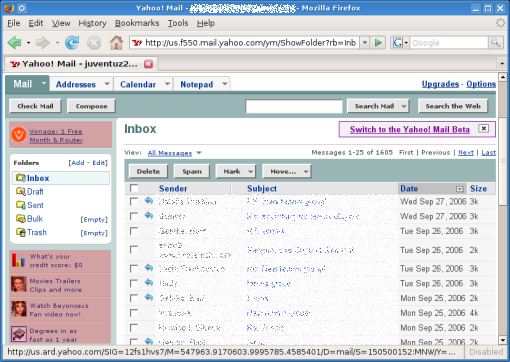
Starting with the existing yahoomail, the service, I'd say, is quite functional. When I log in, I come to an "overview page", which is basically Yahoo's pretext for showing me ads. It also has some clearly non-localized stories from Associated Press which I've never even looked at. I've learned to ignore this page and click on my inbox, which opens the page shown in the screenshot. Here I have a list of messages, with folders on the left. Clicking on a message takes me to it (no AJAX, so I have to wait for a new page to load), but I can middle-click to open a bunch of messages in separate tabs, which I often do. This interface can be quite slow at times (whenever my connection is poor, or yahoomail is overloaded), so loading each new messages can take a while in those circumstances. There is an address book, and I can explicitly add entries to it by typing in new contacts. The message composer is very basic, but it has auto-completion for typing in email addresses in the recipient field (pulled from the address book, naturally). yahoomail has a spam filter, suspected spam lands in my Bulk folder, but I have mixed results with the filter. The ads are all concentrated on the left sidebar and aren't intrusive at all, the trained eye can easily ignore them. The total screen area occupied by ads is 6.6%.

gmail.png

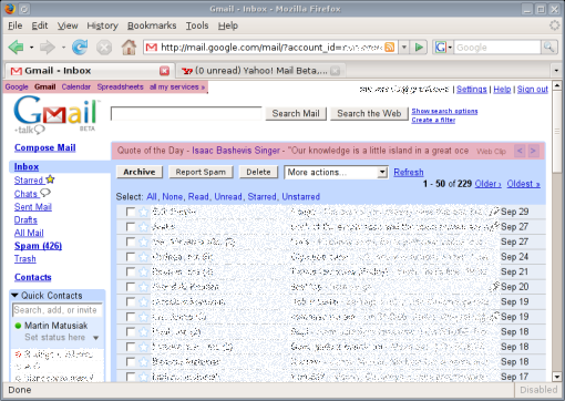
Then came gmail, and made big, big waves. No other webmail service has made so much noise before. Well, gmail was one of the first mainstream websites to introduce AJAX to the world. When I log into gmail, I immediately see my inbox. This tends to take a little while, apparently there are quite a few things to load behind the scenes. But once it pops up, I see what the screenshot shows. Again, I have a list of messages front and center, with a list of folders on the side. It also displays my contacts below that. Interestingly, the contact list is not a static entity, it is built dynamically out of contacts with which I exchange emails. So I don't have to type in entries in my address book manually, it is done for me. (As a small sidebar, I can also use the contact list to chat with my contacts over googletalk, without leaving my inbox.)

Clicking on a message here opens the message on the same page, which is quicker than loading a new page. Unfortunately, middle-clicking on the message title doesn't work here. gmail is packed with AJAX functions, however. For instance, marking messages as spam removes the message from sight dynamically. The message composer is a bit more advanced, there is a rich editor available, and a built-in spell checker. Once again, auto-completion for typing in message recipients (pulled from my dynamic contact list). gmail's spam filter is very good, I only get the odd message in my inbox that doesn't belong there. The advertising is also very discrete, just text, no images, and blends right in with the rest of the page. The advertising area is 4.4% of the page.

The search function, powered by google, enables me to find old messages with good accuracy, which is something yahoomail doesn't have at all.

yahoo_beta.png

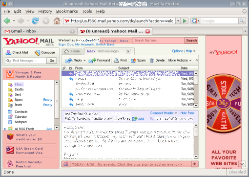
gmail isn't news, it was news. Let us then turn to what is news presently - the new yahoomail beta. The new service has received some glowing reviews, I won't bother digging for them - those who have written it know who they are. yahoomail beta is Yahoo!'s response to gmail, then. Let's see how they compare. The first thing very striking about the new service is the amount of advertising they have put on it. It's impossible not to notice this, it immediately strikes me as one of the more ad infested websites I use. The pink bits here make up for a total of 20.8% of the whole page. Do you see the little arrow in the bottom right corner? The tooltip for that reads "Click to scroll down to view the rest of this advertisement". How adorable is that? Has anyone ever scrolled to see more of an ad? Okay, let's put that aside for now. Logging into yahoomail beta again opens an "overview page", which is again just a place to display ads and news stories. I'm not the slightest bit interested in news, I'm looking for my email. So I click on the Inbox tab.

This is Yahoo hoping that frames will come back in style. I have a list of my messages, with a display area below it, just like in most mail clients. So when I click on a message title, I see the message in the display area. Below the message display area there's an endorsement for Yahoo's calendar, which I have absolutely no use for (and it's impossible to remove the little ad to better use the available screen space). On the right, there's a huge ad. This interface is horrid design. Web design 101 says every website should be tested across a wide range of screen resolutions, to make sure it functions well in them all. Either Yahoo is oblivious to this, or they just don't care. At the same time, the fonts have become smaller, which suggests that the pages aren't meant to be viewed at high screen resolutions anyway (ie. they really want you to have that kind of ads-to-content ratio). With the amount of space occupied by ads, the list of messages and the message display area beneath is squashed in between frames, and is a real pain to use. When I open my inbox, I only see about 7 messages in the list, and there's no way for me to scroll the page, because the list is in a damn frame. When I click on a message title, I get about 5 lines of message text displayed in the display area, which is about as convenient as reading the same message off the screen of a cell phone. And this is it, there is no "open message in a new tab/window" or anything like that, this is the only way to view messages. The most important element of a webmail system is browsing the inbox and reading messages, and Yahoo have completely botched it. I could just as well end it here and declare yahoomail beta a broken service. But in the spirit of completeness, let's finish this.

On the left, I have my list of folders, and a new search box to search my email, which I guess is a brand new gmail-ish feature that yahoomail beta is hoping will make it possible for us users to maintain some idea of our email history. The classic yahoomail really lacks this, it only gives me an option to browse old messages, 25 message titles per page, until I find the one I'm looking for.

The address book does not seem to have changed in the new yahoomail, I still have to add contacts by hand. The spam filter I imagine is the same as with classic yahoomail, but I haven't used the service long enough to know for sure. The message composer has been given a makeover, it now has a rich text editor and a spell checker. There are some AJAX additions to the interface, like "dynamic" spam classification of messages (like gmail has). But these additions are very underwhelming considering how slow and bulky the service generally feels. There are way too many ads, gmail's pages are much simpler and more to the point.

gmail is head and shoulders above yahoomail beta, it is intelligently designed to be efficient and "smart". yahoomail beta is a patchwork of half baked ideas and compromises, which results in a service that is less functional than the original one. yahoomail beta is not about to win significant market share unless it gets a complete redesign (which is generally not something you do with beta software). I am migrating my email increasingly to gmail, and the launch of yahoomail beta has begun to speed that up.

In a few parting words, here are some of the quotes yahoomail beta proudly prints on its opening page.

  • "The new interface is stunning in its simplicity and ease of use."
    — PC Magazine
  • "Yahoo! Mail came out on top again."
    — Associated Press
  • "Graceful, swift, and respectful of your privacy, Yahoo! Mail Beta makes a gracious e-mail host..."
    — CNET

Enough to impress executives, is it? But will it fool the users? Not a chance.

EDIT: Apparently the classical yahoomail does have a facility to search in messages, this seems to be a recent addition as I've never seen it before.

welcome to the family, Trekstor

September 26th, 2006

I bought a usb stick 6 months ago. I was skeptical, as I didn't think I would really need it, and it turns out it was only useful for about 2 weeks. Now it's just lying on a shelf waiting to be used for something again. I bought the cheapest one they had at Media Markt, I believe it was about €22 for 256mb. The brand was Trekstor, a company I had never heard of before, but on the box they print that the stick is compatible with Linux, how unusual. So I bought it, and it was. After all, it's just a usb mass storage device, of course it's compatible, it's the most common type of usb device. But it's refreshing to get a break from the "requires Windows" mantra, for a company to have the guts to print "Windows/Mac/Linux" on the box.

trekstor_usbdrive.jpg

So the other day I was looking for an external usb drive, cause my laptop drive isn't that big, and lo and behold, there's Trekstor again. Again they're the cheapest and they even have a penguin on the box. So I went Trekstor again, a nice quiet 200gb external drive is now the latest addition to my [very short] list of gadgets. The little printed manual doesn't mention Linux at all, but the instructions for Windows are exceedingly simple, and Linux users don't need that hand holding anyway, if there's a driver for the device somewhere on the internet, they will find it and figure out how to use it.

trekstor_penguin.jpg

It turns out Trekstor also manufactures mp3 players. If and when my iRiver dies, I will seriously consider going with Trekstor. They may not have the strong audio focus of iRiver, but they support ogg (which so few companies do) and their players are based on... usb mass storage, just like the usb stick and the external hard drive. And since iRiver seem to have gone completely native with DRM, it's time to look for another vendor anyway.